
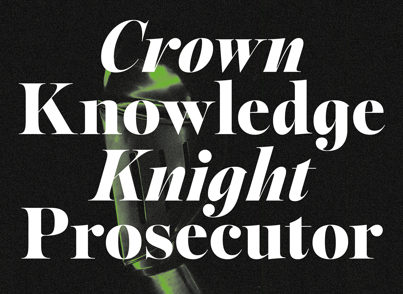
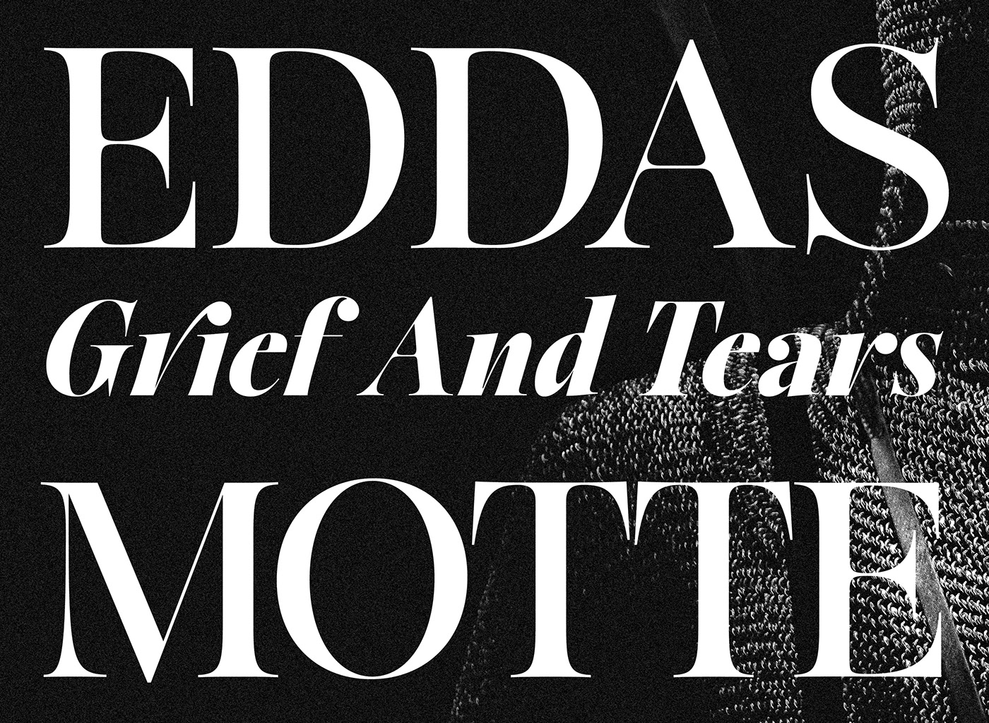
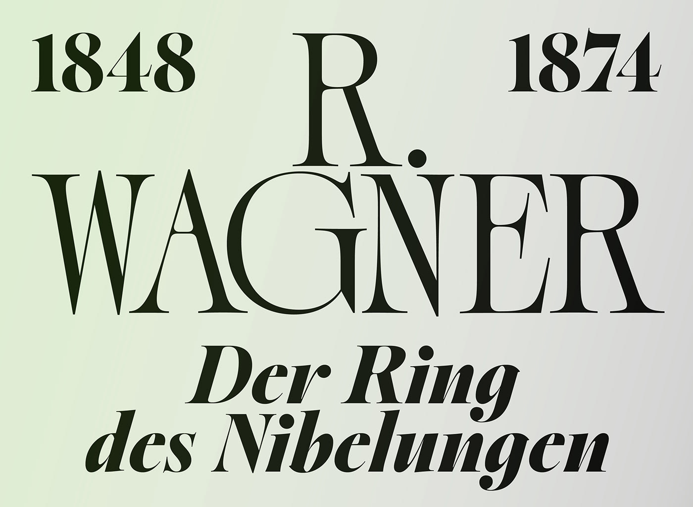
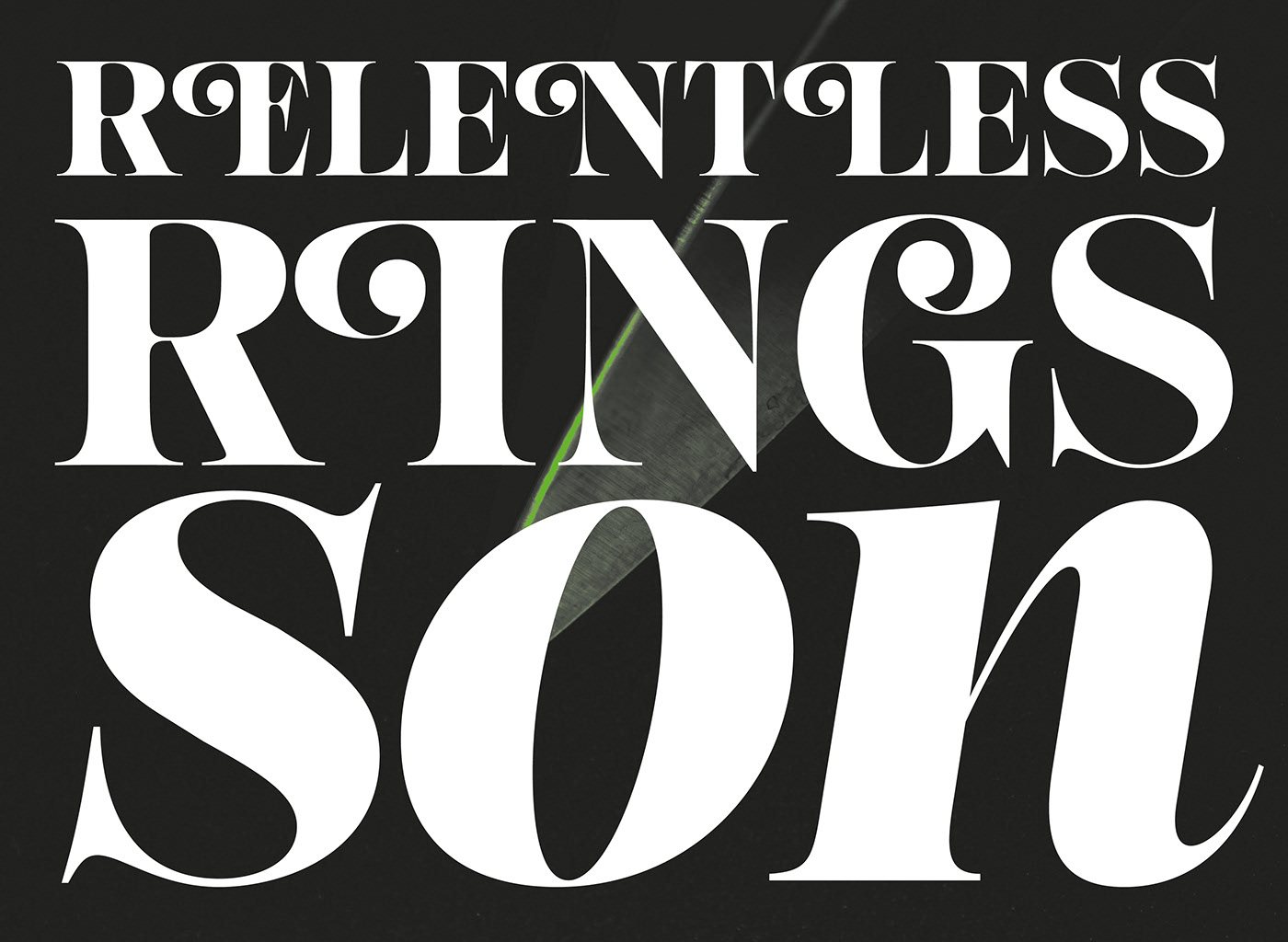
The Sigurd font family is inspired by the hero of the Nibelungen Saga, Siegfried, Sigurd is a font family gathering its inspiration in the shapes of swords and feudal armors. It aims to be an elegant font family yet deeply strong in its design construction.
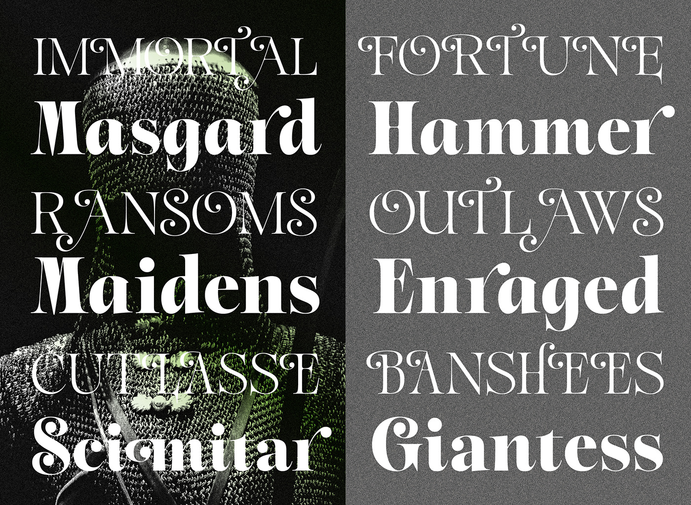
The design process started from an old scrap of letters found in an obscure set of the Eda stories. The letters drawn in an extreme italic version of the word ‘Sigurd’ were the starting point and now the typeface family consists in seven weights with two sets of matching Italics with different angles for a total of 21 fonts.
Containing a wide set of alternates, swash and various open type features, this broad family will allow you to experiment and enable incredible type focused designs. Pretty much like practicing with a sword, you’ll need to spend time with it, trying it out, discovering its sharp endings and eloquent shapes. Thought for an heavily use on anything display size related, you’ll find it wonderful when it comes to headlines, logos, album covers poster designs and such.
Showreel video by Loïc Goraguer.