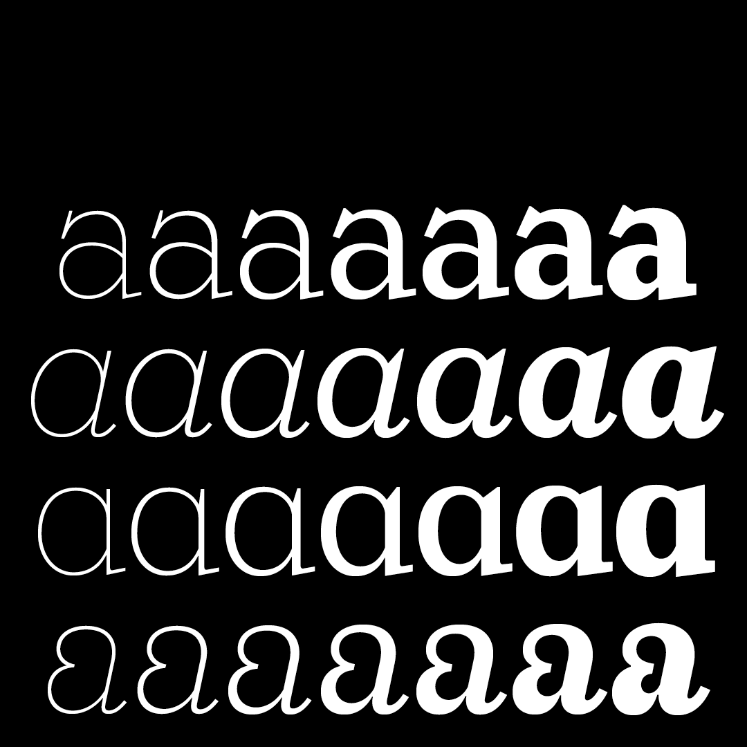

Ernst is an elegant but playful slab serif which harks back to some peculiar early 20th-century types but responds to contemporary demands by offering a wide range of applications. Not properly a revival, Ernst blends type details from avant-garde faces such as Ernst Deutsch/Dryden’s Tango and Georg Belwe’s Belwe Antiqua. Its pronounced and frisky details make it a strong candidate for display work, while the big x-height, its design rigour and consistency of proportions also make it suitable for long texts.
The name Ernst is a tribute to Ernst Deutsch/Dryden, an Austrian designer who in his younger years did some remarkable lettering besides his Tango typeface released by Schriftgiesserei Julius Klinkhardt in 1913–1916, and later by H. Berthold AG. In German ‘ernst’ means ‘serious’; but our Ernst is anything but serious – especially with its whimsical italic that recalls the lettering of early 20th-century Parisian street theatres and silent movies.
Ernst and its italic come in a range of seven weights, from Thin to ExtraBold, and feature old style figures, small caps and some alternate letters.